 Q: You’ve just come back from one of the biggest UI/UX conferences in Eastern Europe. How did you like it?
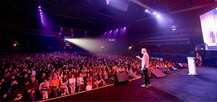
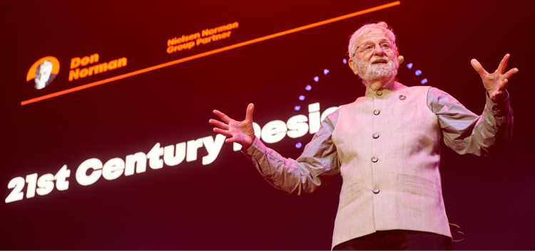
Dmitriy: It was great! Over 1000 participants and speakers from the USA, Switzerland, Germany, Japan, and Israel gathered to share experience and have some fun. The presentations of speakers from Airbnb, SoundCloud, and Kiwi were very useful, but the most significant one was the keynote speech from the person who coined the term “user experience,” Don Norman. I am so inspired and motivated!

Don Norman talks about the 21st Century Design at the Krupa stage
Q: What were the main topics discussed at the conference?
Dmitriy: The event was dedicated to the best practices in interface development, facilitating product UI development, design transformation, and visual design testing. I was particularly interested in learning about interface challenges and innovations since an easy-to-use interface is the very thing we’re pursuing at Epicflow. People want a simple, easy-to-use, intuitive, and feature-rich system to manage projects. They’re looking for a project management tool which removes all existing bottlenecks and streamlines all ongoing processes. At the conference, I gained new ideas on how to bring more simplicity to Epicflow. I’m looking forward to implementing them in the near future.
Q: What are the main elements of a good web product interface?
Dmitriy: A good user interface design should be easy to use, even if it aims at meeting numerous user needs. It should be visually pleasing so the user enjoys the product. It’s also reasonable to make sure that it’s findable, which means that users can easily find solutions to the problems they encounter while using the product. And it should be universally designed so everyone can benefit from it. Project leaders and C-levels use Epicflow every day, and we’re keen on bringing an awesome experience to our users. After all, an interface should be as comfortable as your favorite shoes.

Inspired visitors at Krupa 2019
Q: What are the top interface challenges now?
Dmitriy: People want interfaces to be as simple as possible today. If there’s too much info, they just leave the page and never visit it again. It was mentioned during the conference that more than 75% of users open an application only one time and then never come back. This is the very reason why the main challenge is to include sufficient information in your app yet make it intuitive at the same time.

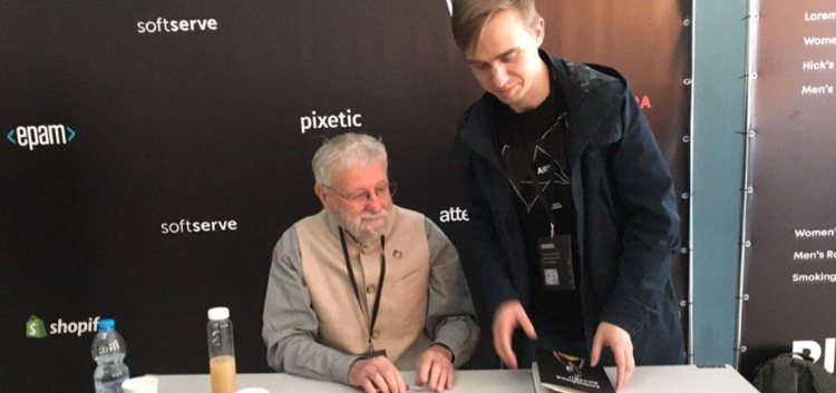
Dmitriy Repin, an Epicflow UI/UX designer, getting his book signed by Don Norman
Q: Would you say interface design is an art or a science?
Dmitriy: I believe that interface design is neither art nor science. Everyone has their own interpretation of art, while with an interface, users should be able to understand it in the same way. To put it bluntly, an interface should resemble human reflexes: it should be invisible. It’s possible to reach invisibility only if your interface is extremely easy to use. I believe that the perfect interface is one that’s perfectly smooth to use.
Don Norman: 3 Ways Good Design Makes You Happy
Q: What were the best insights at the conference?
Dmitriy: I learned that user experience is dependent on the efforts of the whole team. That’s why we study our customers, communicate with them, and learn their needs and pains. PM researchers, marketing and sales teams, designers and analysts – everyone makes their contribution to the Epicflow software for managing multiple projects, tests it, adjusts it, transforms it, and watches it gain maximum functionality.
A high-quality product needs to be memorable, be able to leave an imprint and evoke positive feelings in the customer. The team also needs to work hard for a single goal: to make the company’s product useful for people and, by extension, the world.
Photos made by Krupa organizers

