Every project manager using traditional project management metrics and tools to run their projects looks for ways to deliver them faster and make this process more efficient. Striving for advancement involves not only PMs’ professional self-development but also keeping up-to-date by using new project management solutions and approaches. Let’s examine the way Epicflow’s team has made the classical Fever Chart critical chain tool more powerful with the Bubble Graph feature.
What Is a Fever Chart in CCPM?
The Fever Chart project management technique is closely related to the Critical Chain Project Management (CCPM) from the Theory of Constraints (TOC). According to it, buffer shouldn’t be allocated to tasks individually but added at the end of the project to ensure its safe completion.
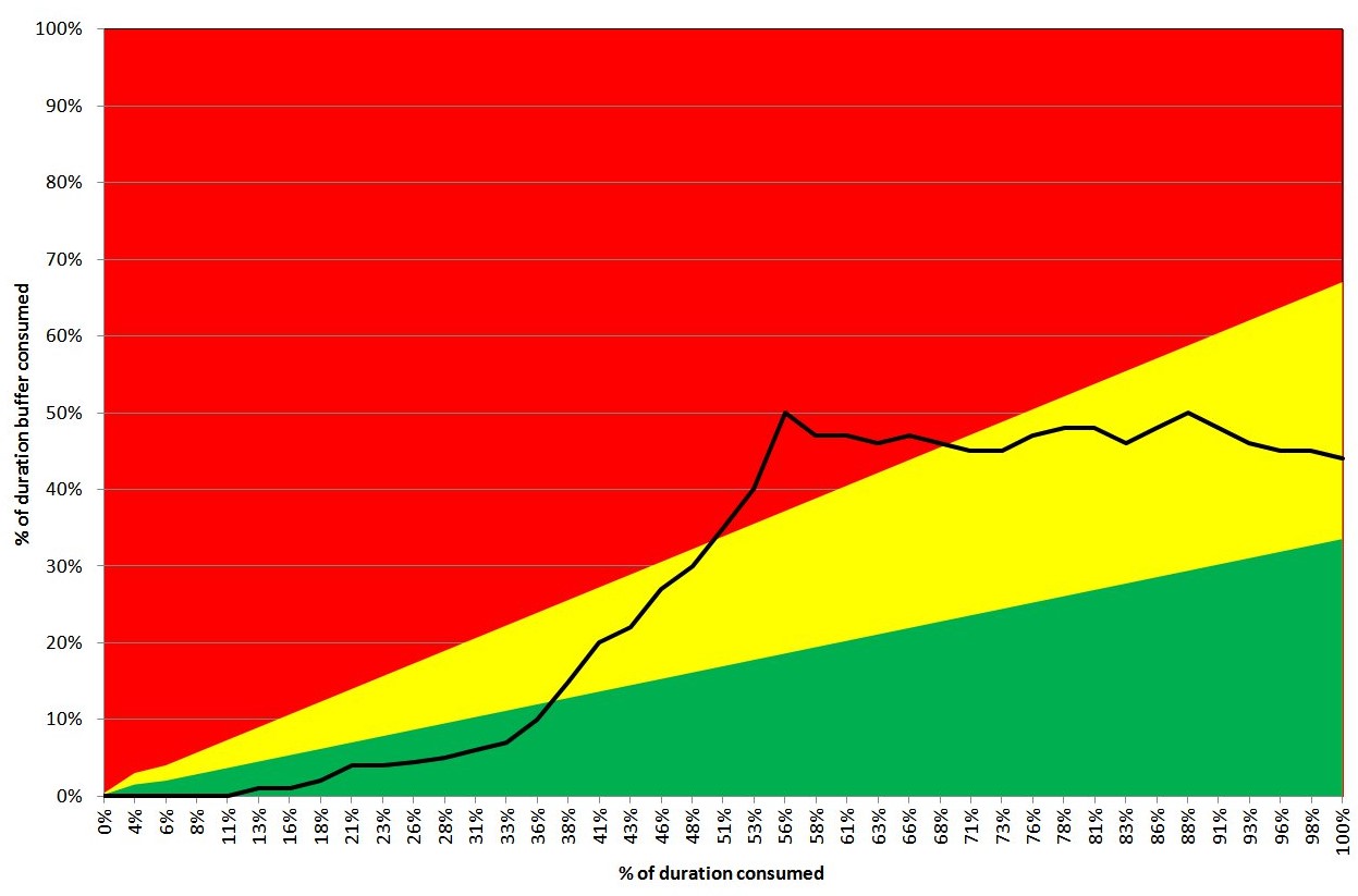
A Fever Chart is a graph visualized with three colors (green, yellow, and red) to display your projects’ progress over time against buffer time and show if there are any constraints. The horizontal axis shows project completeness in %, and the vertical one denotes the buffer consumption. The project is presented as a line with dots denoting its status.
The Fever Charts provide project managers with the following benefits:
- Visual tracking of buffer consumption;
- Optimized buffer management;
- The opportunity to take corrective action before it’s too late;
- Focusing on the entire project’s flow rather than individual tasks.
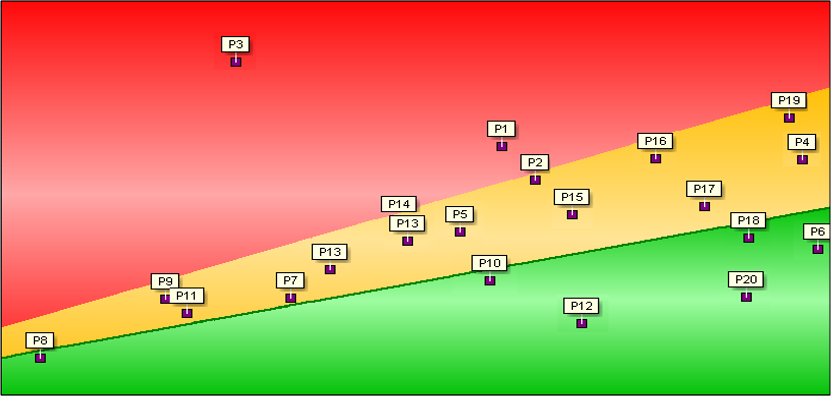
One of the chart’s main disadvantages is that when there are several projects running in parallel, it looks messy. In this case, effective project control and informed decision-making become challenging.
How to Track Progress with Fever Charts?
The chart is used to track the difference between the scheduled project execution and the actual state of things. The rule is simple: when the current progress is in the green line, you’re doing well. If it’s in yellow, something is going wrong and the projects need your sharp attention. When it goes to red, urgent actions are necessary.
Below, you can see an example of the Fever Chart project management tool:
Read more: Tracking Performance: Switching from Project to Resource Level
Fever Chart’s Disadvantages: Why Has Bubble Graph Become a Necessity
Epicflow team had a number of reasons for creating a brand-new chart with a lot of enhancements. Today’s project managers need more advanced solutions than just a primitive graph with dots.
Here’s a list of information that is missing in the fever diagram:
- the structure and size of a project;
- severity of the problem (required by C-level managers);
- what tasks block the flow;
- the reason why projects “have a fever”;
- how much time a team has to “break the fever”;
- the amount of work remained;
- correspondence to budget limits.
Modern technologies make it possible to create smart infographics that are easy to perceive and work with. So, why not do it?
What’s Bubble Graph?
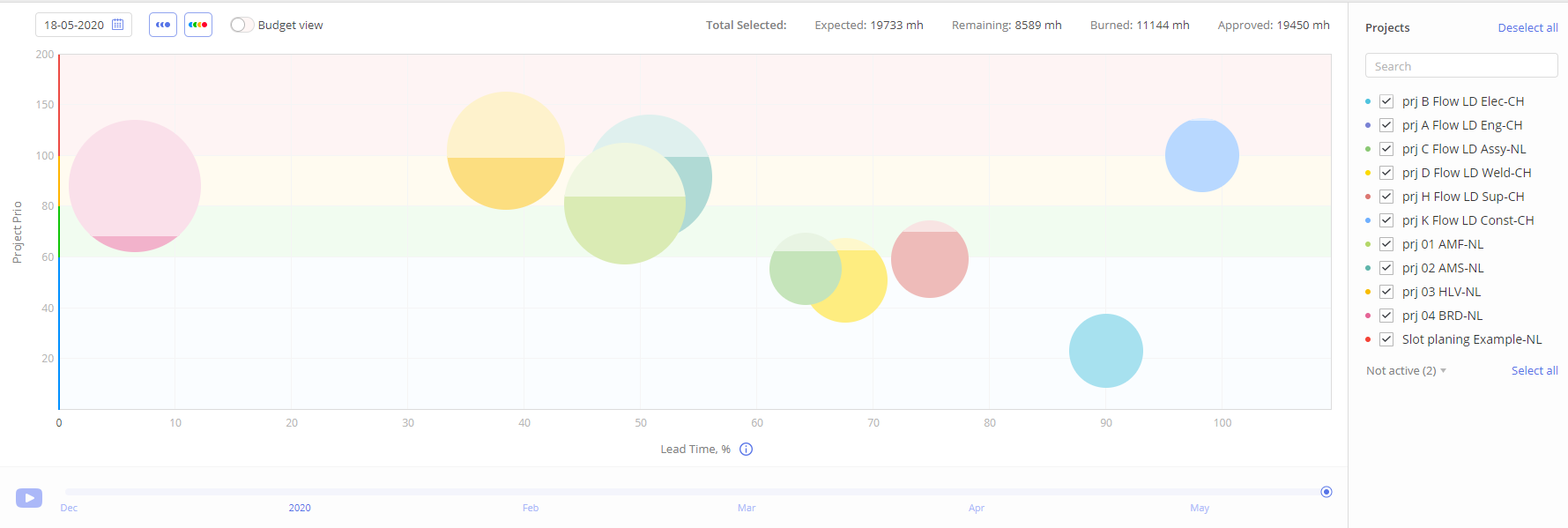
The latest web developments make it possible to create advanced infographics. In fact, the Fever Chart was invented in the previous century. A Bubble Graph is a modern Fever Chart used as one of Epicflow’s features. We’ve managed to present complex information in an absolutely easy, bright, and distinct way. You can find the Bubble Graph in Epicflow’s Dashboard menu.
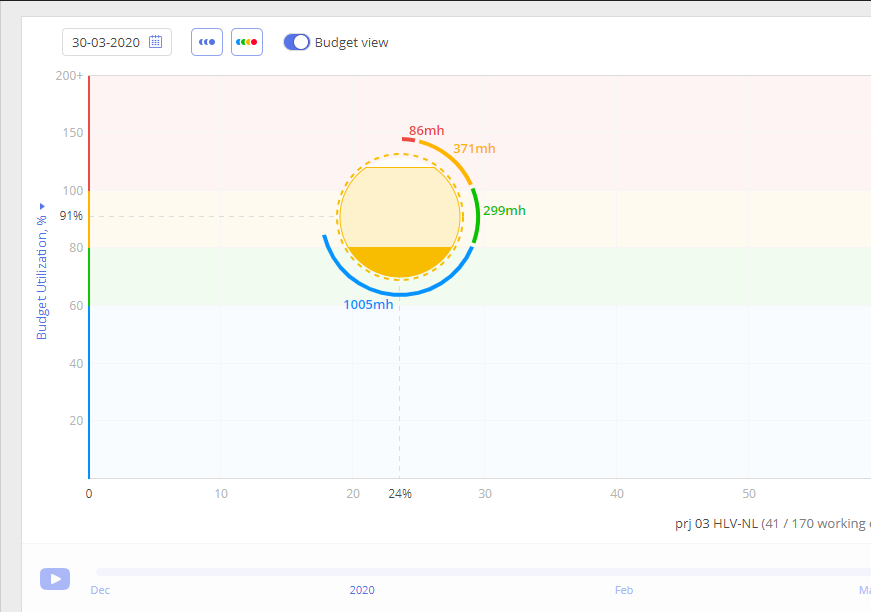
In the Bubble Graph, projects are visualized as bubbles of different colors, making it easier and more comfortable to differentiate them. Bubbles also vary in size depending on the scheduled number of man-hours necessary to complete the project, which in turn, depends on the number of tasks and their complexity. The dark color within a bubble is the work performed, and the light one is the amount of the work remained.
The chart is presented with the following four colors: blue, green, yellow, and red. Blue and green mean you have no threats in your project management process, and everything is performed according to the schedule. Blue means that you have an abundance of buffer. The yellow color is designed to catch your attention and stimulate you to take action not to allow your projects to move to the red section. And the red area is critical. It means your progress is in trouble, and you have to take some urgent actions to fix it.
Advantages of Epicflow’s Bubble Graph
The Bubble Graph opens up the following opportunities for you:
- Assessing the state of the whole project environment at a glance.
- Examining tasks that slow down your flow and “cause a headache”.
- Checking whether a project remains on schedule and within the limits of the approved budget.
- Getting insight into budget utilization.
- The opportunity to track both the whole project environment and individual projects.
Read more: How to Choose the Right Project Management Tool: Selection Guide
Fever Chart vs. Bubble Graph: Similarities and Differences
What’s in common?
Having compared the Fever Graph and its up-to-date upgraded version, we distinguish the following things they have in common:
- Both charts have the same idea at their core: they visualize the project flow with regard to the due date.
- This kind of graph is a must in project management, especially when you have multiple projects to run simultaneously. It allows management to focus on the project that needs their attention. As Dr. Goldratt stated, the real constraint in projects is management attention.
- In both graphs, the background colors serve as an indicator that helps to solve the tough situation before something uncorrectable happens.
- Both are intuitively easy to use.
- Both charts can be utilized for multi-project management (though, as noted above, the Fever Charts look messy when there are several projects in them).
What’s the difference?
- The Bubble Graph is dynamic, which makes it more convenient for users as compared to Fever Charts. You can watch the bubbles moving through the graph field when switching the playback option to see your projects’ flow in a certain period in the past up to the current date.
- You can get all project-related data in the Bubble Graph by clicking a project.
- In the Bubble Graph, you can zoom in on micro and macro levels to see the necessary details.
- The Fever Chart project management tool addresses only time constraints, while the Bubble Graph also shows the budget constraints, as it has project and budget views.
- The Bubble Graph shows the relative buffer, which is the remaining buffer in % based on the remaining amount of work and time. In CCPM, they use the absolute buffer.
- In the Bubble Graph, you can see detailed information about the amount of work you have to do to improve the critical state of your projects.
- You can go from a project to the task level to examine which constraints your projects are facing. The Fever Chart shows limited project-related information.
Read more: 7 Current Trends in Project Management [2025]: What to Prepare for?
Conclusion
In general, the Bubble Graph serves the same purpose as the Fever Chart, but does it better by making data easier to perceive and analyze. They are both invented to avoid project failure by detecting constraints on time to save it. But the thing is that the Fever Chart was invented in the last century, and it’s high time to embrace new insights and technology based on the great ideas of Dr. Goldratt, who has made a great and ever-living contribution to the project management theory.
If you want to find out more about the Bubble Graph or other features and capabilities provided by Epicflow, multi-project management software, don’t hesitate to contact us and book a demonstration.
Frequently Asked Questions
What is a Fever Chart in TOC?
A Fever Chart is a graph that displays your projects’ progress over time against buffer time and shows if there are any constraints.
What is a Bubble Graph?
Epicflow’s Bubble Graph is a modern alternative to the Critical Chain Fever Chart. It helps project managers track projects’ progress regarding the existing time and budget constraints.
What is the difference between a Fever Chart and a Bubble Graph?
Both charts have a similar purpose: providing opportunities for controlling projects. At the same time, the Bubble Graph is more convenient for a multi-project environment and provides more advanced opportunities for comprehensive monitoring of the multi-project landscape.
References:
Goldratt, E.M. (1997), Critical Chain, 1st ed., North River Press, Great Barrington, MA.
Goldratt, E.M. (2010), “What is TOC?”, in Cox, J.F. III and Schleier, J.G. (Eds), Theory of Constraints Handbook, McGraw-Hill, New York, NY, pp. 3-12.